Case study / Cavnue
Designing an information dense dashboard for autonomous vehicle sensors
At Cavnue I designed Cavscan, a dashboard that let engineers monitor the health of hundreds of roadside sensors across active AV corridors in real time.
Quick Info
Background
A few things to know before diving in.
1
Cavnue
Cavnue is an AV infrastructure startup incubated inside Sidewalk Labs. Its mission: build the roadside infrastructure that makes autonomous vehicle corridors viable at scale, bridging the gap between AV software and the physical road.
2
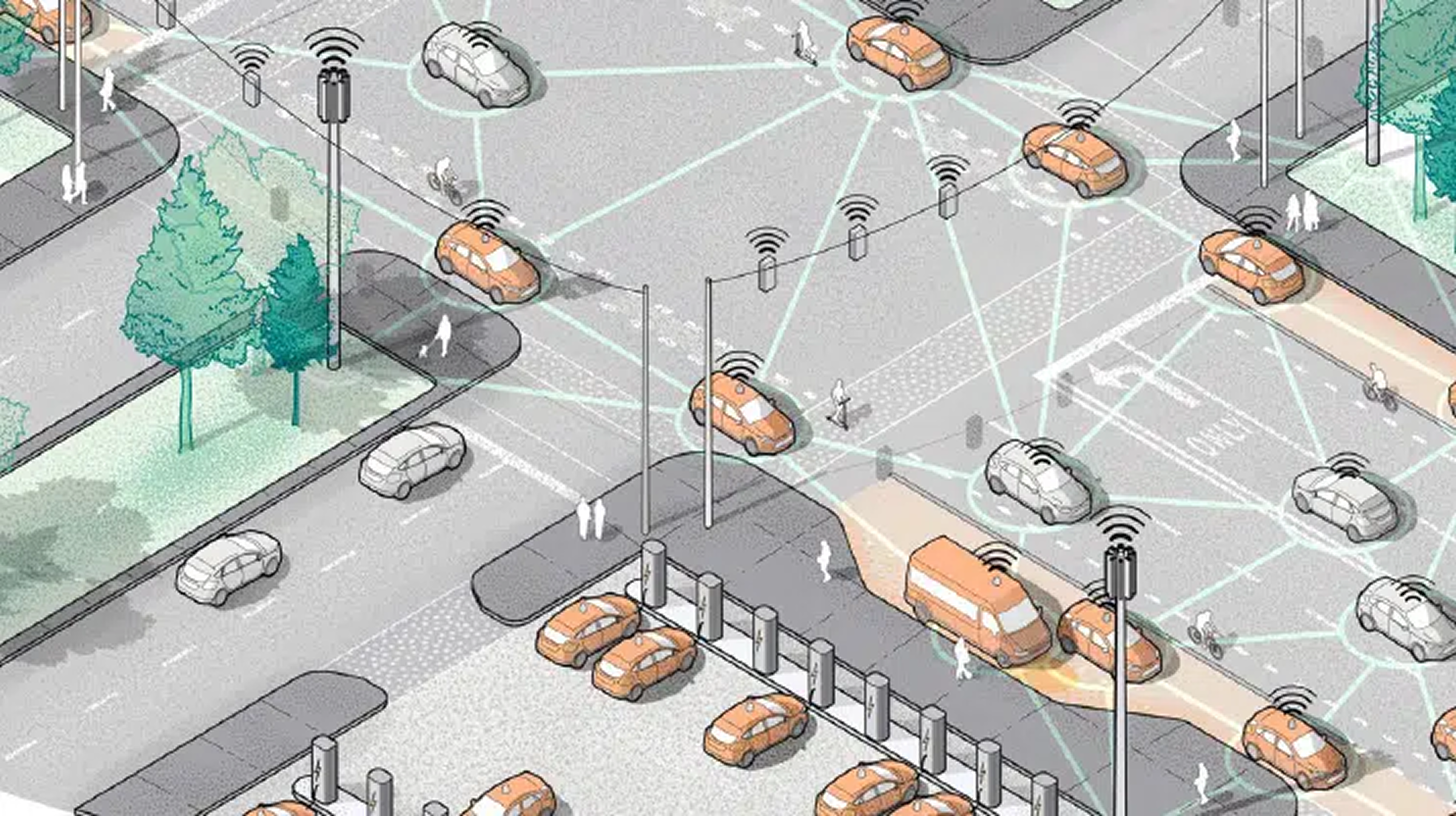
The Corridor
Cavnue operated sensor-equipped road corridors. Each corridor is lined with poles carrying cameras, radar, IMU sensors, and compute hardware that continuously stream data to autonomous vehicles traveling the dedicated lane.
3
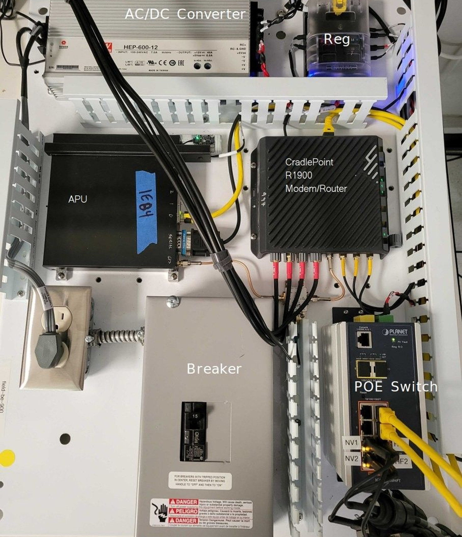
The Hardware
Each pole contained a layered stack of networked components: Jetson Xavier compute units, APUs, POE switches, Cradlepoint modems, video encode and decode modules, and detection and tracking software, all tightly interdependent.
4
System Health
Keeping a corridor operational meant knowing the real-time status of hundreds of components across multiple poles. Any degraded component could compromise the data quality that autonomous vehicles depended on.
The situation
Complex hardware in the field, with no unified view of its health
The corridors were generating data. The hardware was deployed. But there was no tool designed to surface that hardware's status to the people who needed it most. Engineers were piecing together system health from raw logs and ad hoc checks, with no single view of what was up, what was degraded, or where in the network a problem had originated. As the first full-time design hire at Cavnue, I was brought in to solve this.
I had to start from scratch, in a domain where no design playbook existed.
The problem I set out to solve
How might we organize a complex sensor network's health data to be immediately useful to every type of user who depends on it?
The task
Design a system health dashboard for a hardware-dense, multi-user context with no design precedent
The hardware was real and in the field. The data was flowing. The missing piece was a surface that made that data interpretable for road operators monitoring corridor uptime, ML engineers validating sensor output, and vehicle OEMs evaluating corridor readiness, all in one place.
The constraints
1
The hardware schema was actively evolving. The design had to accommodate a moving target without breaking every time a new component was introduced or renamed.
2
Three distinct user types with meaningfully different needs: road operators, ML engineers, and vehicle OEMs, each with a different layer of the hardware stack to care about.
3
Status had to read instantly. Downtime in the field had direct operational consequences. The interface couldn't require parsing or interpretation under pressure.
4
The MVP needed to serve internal users first, then scale to external beta partners at real-world test sites without a full redesign.
5
No existing tool solved this problem. Available traffic monitoring software was decades behind and not built for component-level hardware visibility.
Clarity / Risk
Weighing what we knew against what could go wrong
Before a single screen was designed, I needed to position the problem. Using a clarity/risk matrix I plotted the challenge: low problem clarity combined with high stakes puts this squarely in Research Heavy territory. That framing justified a long discovery phase before any design work began.
The problem sat in the Research Heavy quadrant: high risk, low problem clarity. That's why weeks went into understanding the hardware, the users, and the domain before a single screen was designed.
The action
A research-heavy start, many explorations, and a hard turn toward simplicity
The problem landed squarely in the high-risk, low-clarity quadrant of a clarity/risk matrix, so research had to come first. I mapped the anatomy of the corridor hardware in detail, held regular syncs with the hardware team as the schema evolved, studied existing traffic monitoring software and analogous asset network tools, and arranged conversations with each of the three user groups to understand what they actually needed in the field.
Early explorations ranged widely: traffic performance dashboards with vehicle throughput metrics, lane-level analytics views, data-dense asset management panels with temporal dimensions, and map-overlaid monitoring interfaces. Each direction was tested against the constraints. The data-dense approaches were powerful but illegible under pressure. Analytics-forward views served one user type and ignored the others. After many rounds, the direction became clear: strip complexity as much as possible for the MVP and iterate upward from there.
Design explorations


The result
The MVP: a scannable, color-coded health grid organized around how the hardware is actually structured
The shipped design organized the corridor by router, then camera, then individual component. Each camera was represented as a card displaying its sub-components: Jetson Xavier, APU, POE Switch, Cradlepoint, Video Encode, Video Decode, D&C, and Tracking, color-coded green, yellow, or red based on real-time status. The entire corridor's health was readable in a single scan.
Clicking any component opened a detail panel showing event ID, timestamp, and granular status for each sub-asset, giving engineers everything needed to diagnose and act without leaving the screen. The same interface shipped as a mobile view for field teams. Status propagated upward: a degraded component turned its camera card yellow; a failed one turned it red. Engineers always knew exactly where to look.


Outcome
The MVP reached the field, reduced downtime, and established the data schema the whole platform was built on.
The data schema was finalized in collaboration with the hardware team during development, becoming a shared source of truth across the organization. Internal rollout to ML and hardware engineers followed, then a limited beta release across the Michigan I-80 corridor and the Ford proving ground. Engineers reported less downtime. The dashboard made it faster to spot and respond to hardware issues before they cascaded. The minimalist MVP held up, and became the foundation to build from.